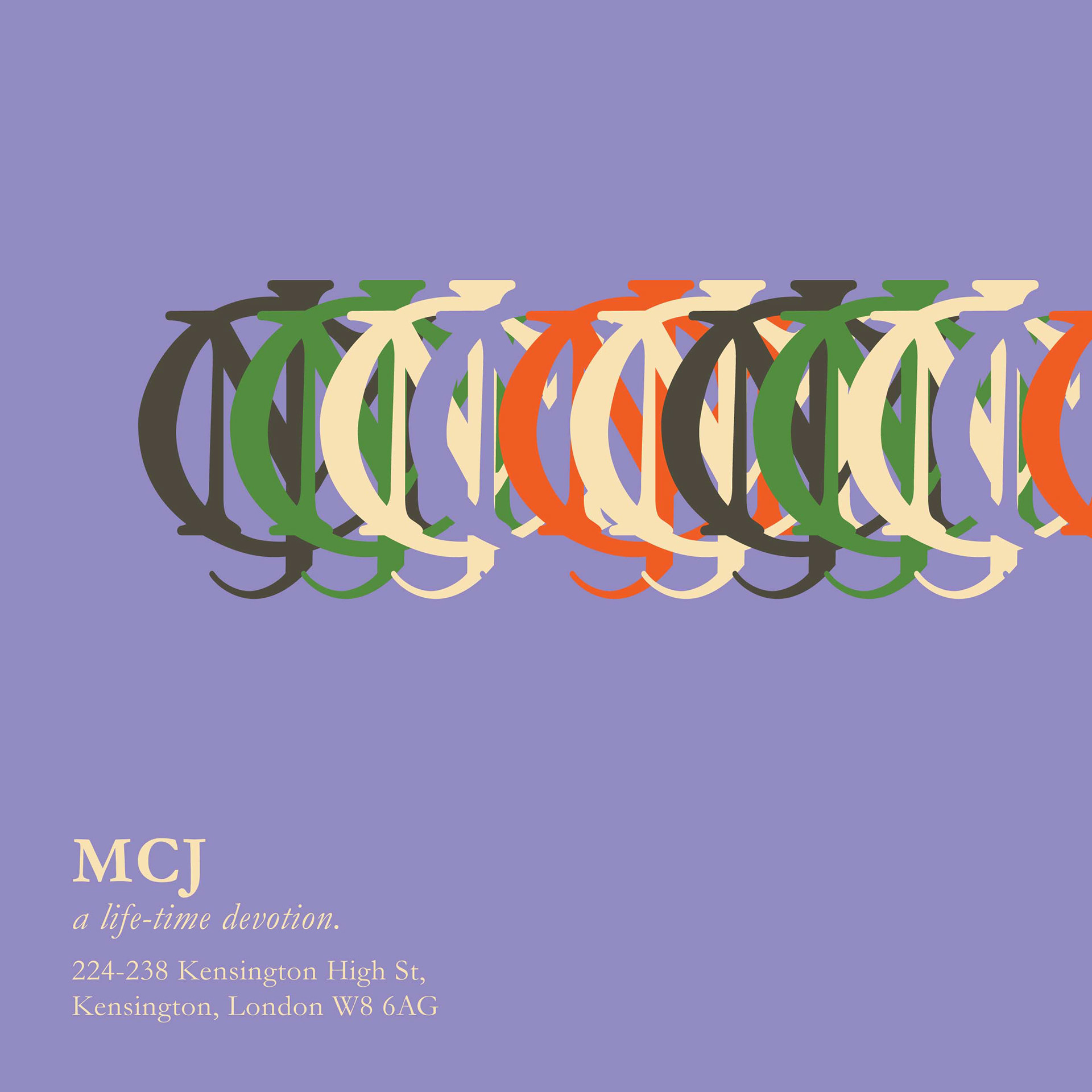
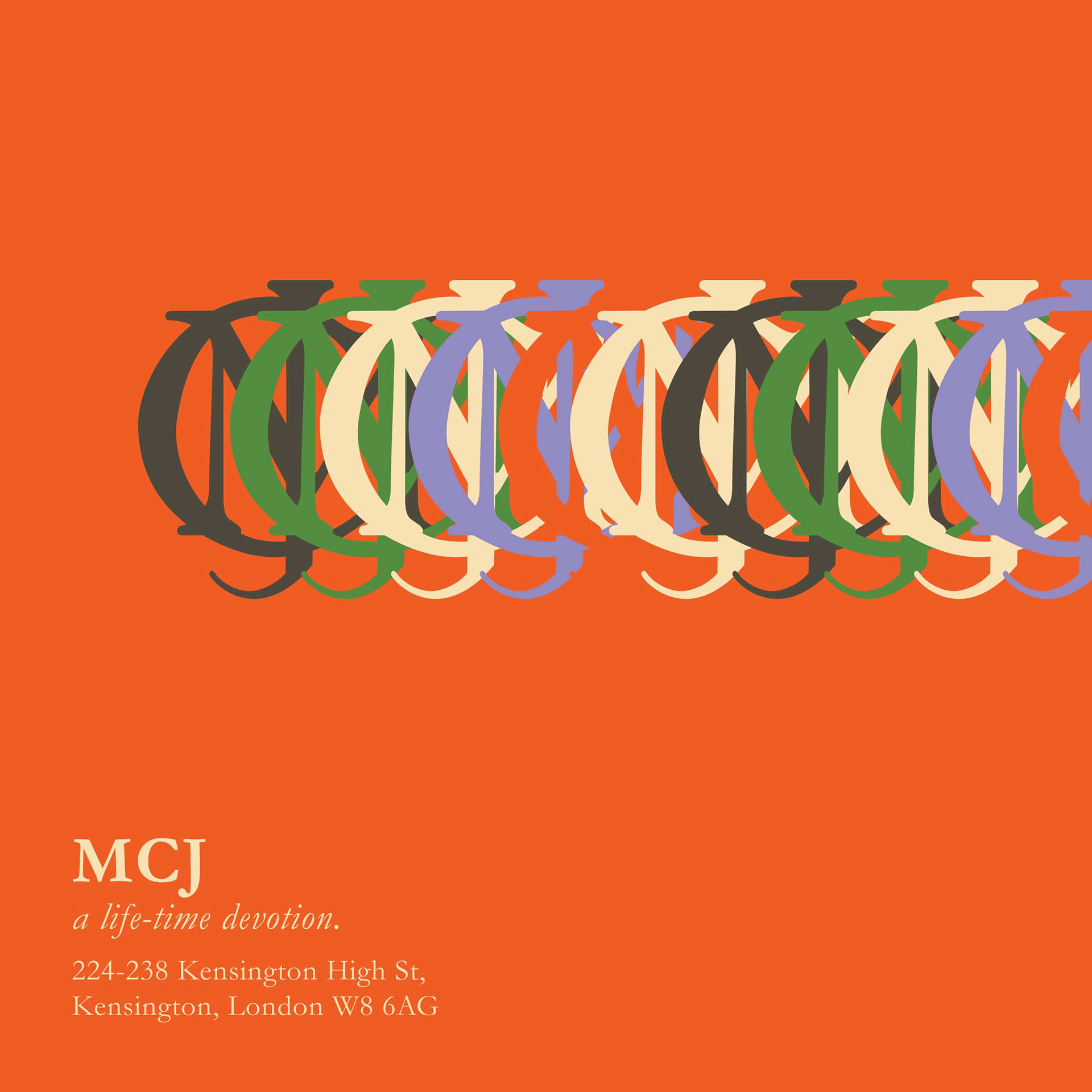
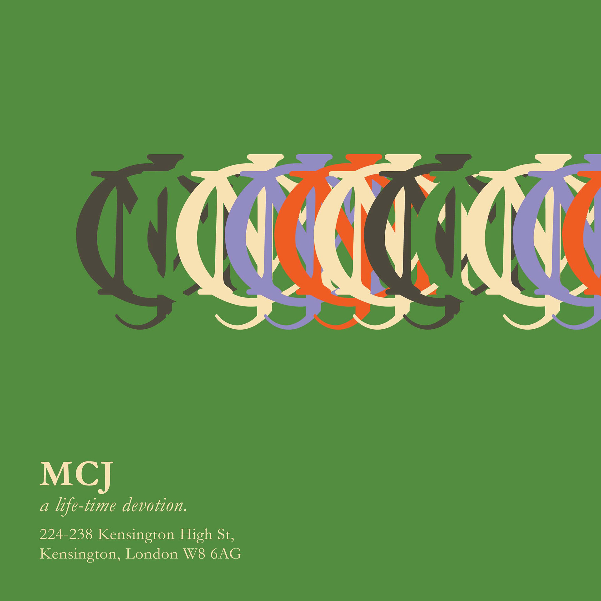
This is a branding design for Margaret Calkin James' exhibition that never been done as a form of protest of the existing design institutions in London. The exhibition's logo adapted from her last signature "MCJ" which is the most symbolic. The color scheme is also coming from the selection of colors in her works. It took me some time to produce a perfect color and composition for this non-existence exhibition. The exhibition date was 7 - 28 December 1992, about 7 years after her death.
Margaret Calkin James was a prominent woman graphic designer in her era. She was educated in Central School of Art and Design which later be joined with St Martins School of Arts in 1989 formed Central Saint Martins College of Arts and Design. Her clients including Lloyds, Transport for London, Royal Mail. Her works are flawless, very neat, and stunning even after digitalisation. Her graphic skill is undoubtedly perfect. She has bright eyes for details and harmony. She keeps producing artworks even after a stroke that paralysed one of her hands. Despite her long-life devotion, her works are not represented in the history of graphic design.
Her signature is a reflection of her career development. She started by writing her full name, her nickname, and chosen an initial "MCJ". It is evolved from her fine script writing, block letters, modern sans-serif, to her unique emblem. Its development represents much of herself, her work, as well as the evolvement of her practice. By exploring her personal characteristic embedded in her signature as a branding, this work intended to build awareness of the under-represented women in graphic design field.
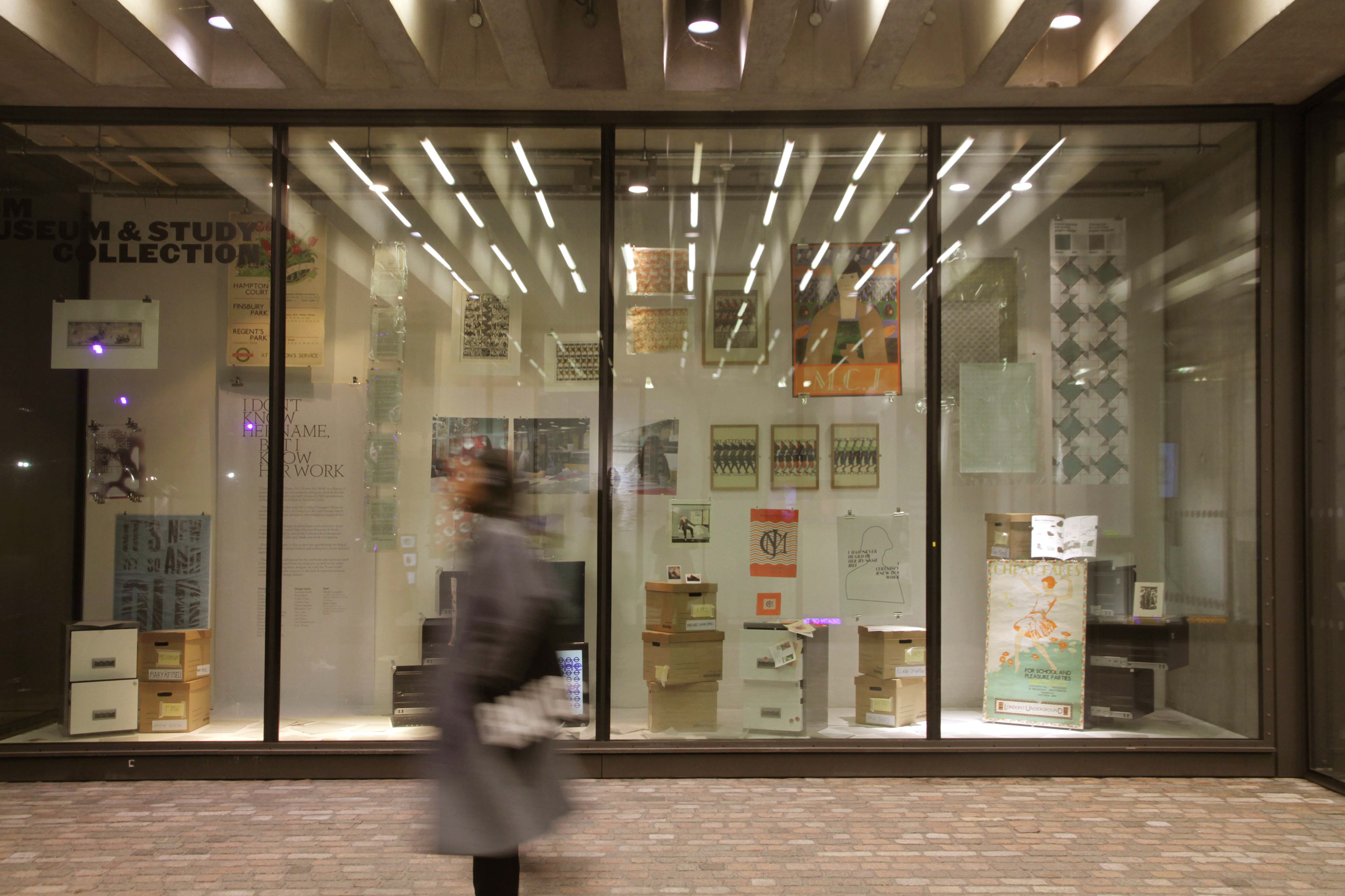
This work exhibited in Window Gallery, Granary Square from 27 November 2017 - 8 January 2018. Also available in CSM Museum & Study Collection
In the exhibition: Ruth Sykes, Sarah Campbell, and other colleagues.